Show the code
data <- read.csv("data/euro-tech-money.csv")Recently, I stumbled upon a Reddit post where someone was gathering salary data from the tech sector throughout Europe. It piqued my interest to explore how these salaries vary among various countries and positions. So, I chose to employ R for data collection and analysis.
Let’s start by fetching the data from the Google Sheet.
document <- "1iTNwiAQ0s5iD6RqI7B30uWqQ8wNJqRnmHvxo5zRffu8"
sheet <- "603717461"
url = sprintf(
  "https://docs.google.com/spreadsheets/d/%s/gviz/tq?tqx=out:csv&sheet=%s",
  document,
  sheet
)
download.file(url, destfile = "data/euro-tech-money.csv", mode = "wb")
Once downloaded, we can load the data into our R environment.
data <- read.csv("data/euro-tech-money.csv")The dataset consists of 572 observations in 12 columns named Job.Title, Company, City, Seniority, Pre.Tax.TC, After.Tax.TC, Yearly.Savings, Lifestyle, Household.Size, Share.of.Household.Expenses, Country, and Timestamp. See summary below.
  Job.Title           Company              City            Seniority
 Length:572         Length:572         Length:572         Length:572
 Class :character   Class :character   Class :character   Class :character
 Mode  :character   Mode  :character   Mode  :character   Mode  :character


   Pre.Tax.TC      After.Tax.TC     Yearly.Savings    Lifestyle
 Min.   : 13646   Min.   :  10000   Min.   : -2000   Length:572
 1st Qu.: 48000   1st Qu.:  32600   1st Qu.:  8000   Class :character
 Median : 70000   Median :  46500   Median : 17000   Mode  :character
 Mean   : 85140   Mean   :  58791   Mean   : 23915
 3rd Qu.: 99600   3rd Qu.:  65190   3rd Qu.: 30000
 Max.   :700000   Max.   :1575000   Max.   :270000
 NA's   :11       NA's   :23        NA's   :68
 Household.Size  Share.of.Household.Expenses   Country
 Min.   :1.000   Min.   :  0.0               Length:572
 1st Qu.:1.000   1st Qu.: 65.0               Class :character
 Median :2.000   Median :100.0               Mode  :character
 Mean   :1.853   Mean   : 82.3
 3rd Qu.:2.000   3rd Qu.:100.0
 Max.   :7.000   Max.   :100.0
 NA's   :22      NA's   :55
  Timestamp
 Length:572
 Class :character
 Mode  :character
Let’s take a look at the location of respondents. We’re going to load a map of Europe and plot the cities where the respondents are located. The map will also show the number of respondents in each city and their median salary in USD.
library(giscoR)
library(maps)
library(dplyr)
library(stringr)
library(ggplot2)
library(ggrepel)

# Load the map of Europe
europe <- gisco_get_countries(
  region = "Europe",
  resolution = 1,
  cache_dir = "/tmp/giscoR"
)

# Get the cities
cities <- world.cities |>
  filter(str_to_upper(country.etc) %in% unique(str_to_upper(data$Country))) |>
  select(name, country.etc, long, lat)

# Change case in the column to title case
data <- data |> mutate(City = str_to_title(City))

# Group responses data frame by the city
by_city <- select(data, City, Pre.Tax.TC) |>
  group_by(City) |>
  summarise(
    resp_count = n(),
    median_salary = median(Pre.Tax.TC, na.rm = TRUE)
  )
# Join the cities and responses data frames
by <- join_by(name == City)

by_city <- inner_join(cities, by_city, by)

p <- by_city |>
  arrange(resp_count) |>
  mutate(name = factor(name, unique(name))) |>
  ggplot() +
  geom_sf(
    data = europe,
    fill = "grey",
    alpha = 0.3
  ) +
  geom_point(
    aes(
      x = long,
      y = lat,
      size = resp_count,
      color = median_salary
    ),
    alpha = 0.9
  ) +
  scale_color_viridis_c(
    trans = "log", option = "plasma",
    breaks = c(25000, 50000, 100000, 200000, 400000)
  ) +
  theme_void() +
  ylim(35, 65) +
  xlim(-15, 40)

p1 <- p + theme(
  legend.position = "none",
  plot.margin = grid::unit(c(50, 50, 50, 50), "pt")
)

ggsave("image.png", plot = p1, width = 8, height = 8)

p + geom_text_repel(
  data = by_city |> arrange(resp_count) |> tail(20),
  aes(x = long, y = lat, label = name),
  size = 4
) +
  theme(
    legend.position = "right",
    legend.key.height = unit(20, "pt"),
    legend.box.margin = margin(0, 0, 0, 20)
  )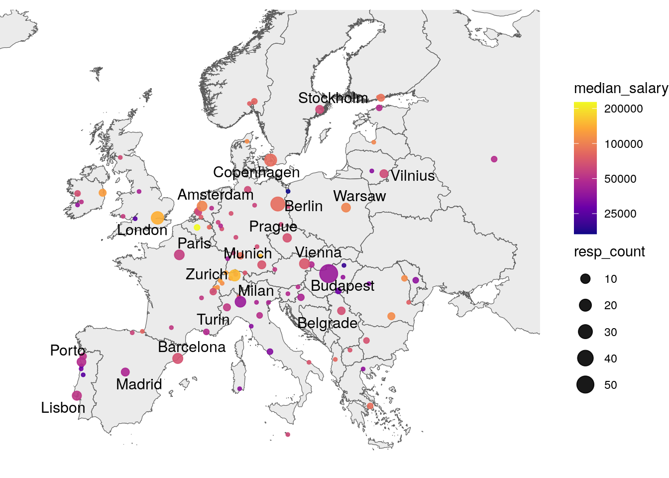
The total number of cities is 105. Below is a list of the top 10 and bottom 10 cities with at least 5 respondents, ranked by median salary. While these plots can provide a general idea of the salary distribution, it is not the best idea to compare salaries across cities directly, as the salary may vary depending on other factors like job title or seniority.
library(scales)

cities_ranked <- data |>
  inner_join(cities, by = c("City" = "name")) |>
  group_by(City) |>
  summarize(median_salary = median(Pre.Tax.TC), resp_count = n()) |>
  filter(resp_count > 4) |>
  arrange(desc(median_salary))


data <- data |>
  mutate(city_rank = ifelse(City %in% cities_ranked$City[1:10], "Top", "Other"))
data <- data |>
  mutate(city_rank = ifelse(City %in% tail(cities_ranked, 10)$City, "Tail", city_rank))
data <- data |>
  mutate(city_rank = factor(city_rank, levels = c("Top", "Tail")))

xlim <- c(
  0,
  max(data$Pre.Tax.TC)
)

data |>
  inner_join(cities_ranked, by = c("City" = "City")) |>
  filter(city_rank %in% c("Top", "Tail")) |>
  ggplot(aes(
    x = reorder(factor(City), Pre.Tax.TC, median),
    y = Pre.Tax.TC
  )) +
  facet_wrap(~ as.factor(city_rank), scales = "free_y") +
  geom_boxplot(aes(colour = median_salary)) +
  scale_color_viridis_c(
    trans = "log",
    option = "plasma",
    begin = 0.,
    end = 0.85,
    breaks = c(25000, 50000, 100000, 200000, 400000)
  ) +
  theme_minimal() +
  coord_cartesian(xlim = xlim) +
  coord_flip() +
  labs(
    x = "",
    y = ""
  ) +
  theme(legend.position = "none") +
  scale_y_continuous(labels = scales::comma)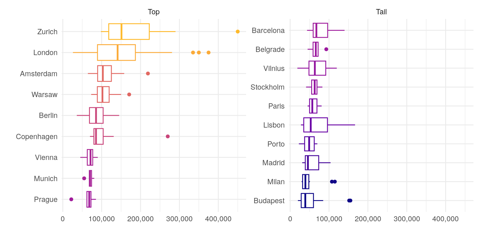
Let’s visualize the median salary by country. Since salaries vary by position, it’s important to include job titles on the axis. However, with 249 distinct job titles, we need to group them into broader categories for clarity.
In the following plot, the size of the point represents the number of respondents, and the color represents the median salary. The text on the plot shows the median salary for each country and job category.
data1 <- data |> inner_join(cities, by = c("City" = "name"))

data1 <- data1 |> left_join(read.csv("data/job-categories.csv"), by = "Job.Title")

country_job_title <- data1 |>
  # Convert to long format
  as_tibble() |>
  group_by(Country, Job.Category) |>
  summarize(
    resp_count = n(),
    median_salary = median(Pre.Tax.TC)
  ) |>
  ungroup()


country_job_title |>
  ggplot(aes(x = Job.Category, y = reorder(Country, desc(Country)))) +
  geom_point(aes(size = resp_count, colour = median_salary), shape = 21, stroke = T, alpha = 0.9) +
  scale_color_viridis_c(
    trans = "log",
    option = "plasma",
    breaks = c(25000, 50000, 100000, 200000)
  ) +
  scale_size_area(max_size = 8) +
  geom_text(
    aes(
      y = as.numeric(as.factor(reorder(Country, desc(Country)))) - sqrt(resp_count) / 20,
      label = format(median_salary, big.mark = ","),
    ),
    vjust = 1.5,
    hjust = 0.5,
    colour = "grey30",
    size = 2.5
  ) +
  theme_minimal() +
  theme(
    axis.text.x = element_text(angle = 45, hjust = 1),
    axis.ticks.y = element_blank(),
    legend.position = "none",
    # legend.position = "right",
    # legend.key.height = unit(20, "pt"),
    # legend.key.width = unit(5, "pt"),
    # legend.box.margin = margin(0, 0, 0, 10),
    # legend.title = element_blank()
  ) +
  labs(x = NULL, y = NULL)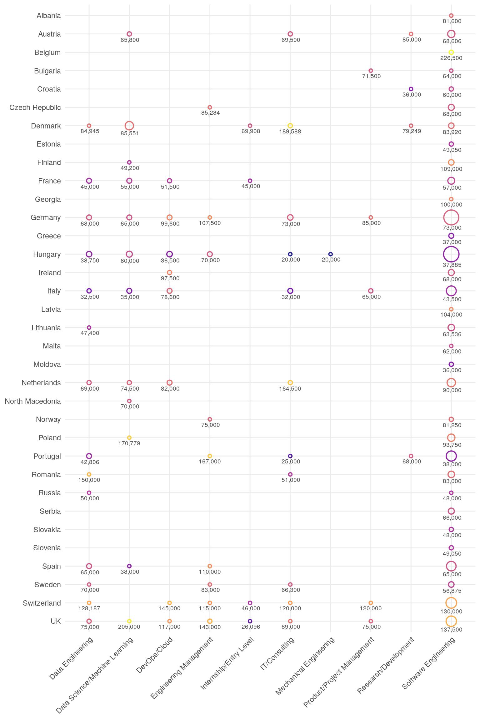
As we can see, salaries vary significantly by country and job title. Directly comparing salaries across these groups can be misleading due to differences in other influencing factors. To better understand the contribution of each factor, let’s build a linear regression model that accounts for these variables and potentially others, while controlling for confounding factors.
data1 <- data |> inner_join(cities, by = c("City" = "name"))
data1 <- data1 |> left_join(read.csv("data/job-categories.csv"), by = "Job.Title")
model <- lm(Pre.Tax.TC ~ 0 + Country + Job.Category + Seniority, data = data1)The linear model, built using Country, Job Category, and Seniority, demonstrates decent predictive power, with an adjusted R-squared value of 0.82. The model’s coefficients represent the effect (in USD) of each factor on salary. Let’s visualize these coefficients to gain a clearer understanding of the impact of each factor.
library(tibble)
model_coef <- summary(model)$coefficients |>
data.frame() |>
rownames_to_column("value") |>
mutate(
effect = Estimate,
error = `Std..Error`,
p.value = `Pr...t..`,
significant = p.value < 0.05
)
model_coef <- model_coef |>
mutate(
variable = case_when(
str_detect(value, "Country") ~ "Country",
str_detect(value, "Job.Category") ~ "Job Category",
str_detect(value, "Seniority") ~ "Seniority"
)
)
model_coef <- model_coef |> mutate(value = sub("Country", "", value))
model_coef <- model_coef |> mutate(value = sub("Job.Category", "", value))
model_coef <- model_coef |> mutate(value = sub("Seniority", "", value))
country_coef <- model_coef |>
filter(variable == "Country") |>
arrange(desc(effect))
country_coef <- country_coef |> mutate(rownumber = 1:nrow(country_coef))
xlim <- c(
min(country_coef$effect - country_coef$error),
max(country_coef$effect + 1.1 * country_coef$error)
)
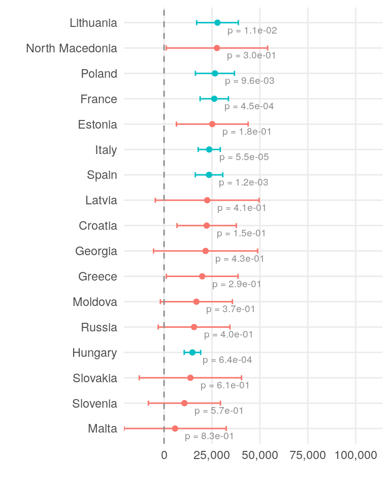
xscale <- c(0, 50000, 100000, 150000)The plot below illustrates the effect of each country on salary. The dot represents the estimated effect, while the error bars show the standard error. The color of the plot elements and the accompanying text indicate the significance of the effect. Only a few countries have a statistically significant impact on salary at the 0.05 level. However, it is generally better practice to consider the overall differences in salaries across countries.
country_coef[1:17, ] |>
  ggplot(aes(x = effect, y = reorder(value, effect), colour = significant)) +
  geom_point() +
  geom_errorbarh(aes(xmin = effect - error, xmax = effect + error),
    height = .2
  ) +
  geom_text(aes(label = paste("p =", format(p.value, digits = 2))),
    vjust = 1.5,
    hjust = -0.2,
    colour = "grey55",
    fill = "white",
    size = 2.5
  ) +
  geom_vline(
    xintercept = 0,
    linetype = "dashed",
    colour = "grey55"
  ) +
  theme_minimal() +
  coord_cartesian(xlim = xlim) +
  scale_x_discrete(limits = xscale, labels = scales::comma) +
  theme(legend.position = "none") +
  labs(x = "", y = "")
country_coef[18:34, ] |>
  ggplot(aes(x = effect, y = reorder(value, effect), colour = significant)) +
  geom_point() +
  geom_errorbarh(aes(xmin = effect - error, xmax = effect + error),
    height = .2
  ) +
  geom_text(aes(label = paste("p =", format(p.value, digits = 2))),
    vjust = 1.5,
    hjust = -0.2,
    colour = "grey55",
    fill = "white",
    size = 2.5
  ) +
  geom_vline(
    xintercept = 0,
    linetype = "dashed",
    colour = "grey55"
  ) +
  theme_minimal() +
  coord_cartesian(xlim = xlim) +
  scale_x_discrete(limits = xscale, labels = scales::comma) +
  theme(legend.position = "none") +
  labs(x = "", y = "")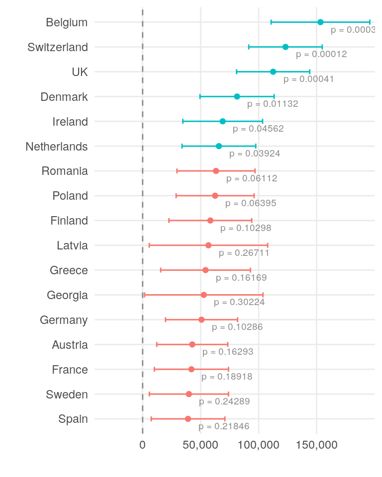
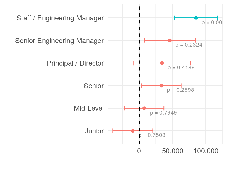
Next two plots show the effect of job category and seniority on the salary. The interpretation is similar to the previous plot.
model_coef |>
  filter(variable == "Job Category") |>
  ggplot(aes(x = effect, y = reorder(value, effect), colour = significant)) +
  geom_point() +
  geom_errorbarh(aes(xmin = effect - error, xmax = effect + error),
    height = .2
  ) +
  geom_text(aes(label = paste("p =", format(p.value, digits = 2))),
    vjust = 1.5,
    hjust = -0.2,
    colour = "grey55",
    fill = "white",
    size = 2.5
  ) +
  geom_vline(xintercept = 0, linetype = "dashed") +
  theme_minimal() +
  scale_x_discrete(limits = c(-50000, 50000), labels = scales::comma) +
  theme(legend.position = "none") +
  labs(x = "", y = "")
model_coef |>
  filter(variable == "Seniority") |>
  mutate(value = str_replace(value, "Senior Staff / ", "")) |>
  ggplot(aes(x = effect, y = reorder(value, effect), colour = significant)) +
  geom_point() +
  geom_errorbarh(aes(xmin = effect - error, xmax = effect + error),
    height = .2
  ) +
  geom_text(aes(label = paste("p =", format(p.value, digits = 2))),
    vjust = 1.5,
    hjust = -0.2,
    colour = "grey55",
    fill = "white",
    size = 2.5
  ) +
  geom_vline(
    xintercept = 0,
    linetype = "dashed"
  ) +
  theme_minimal() +
  theme(legend.position = "none") +
  scale_x_discrete(limits = c(-50000, 50000)) +
  labs(x = "", y = "") +
  scale_x_continuous(labels = scales::comma)
Net salary is what matters most to employees, but it differs from gross salary. Taxes and social security contributions can significantly reduce take-home pay. Let’s calculate the net salary for each respondent and visualize the distribution of net salaries by country.
library(tidyr)

net_by_country <- select(data, Country, City, Pre.Tax.TC, After.Tax.TC) |>
  inner_join(cities, by = c("City" = "name")) |>
  mutate(Tax = Pre.Tax.TC - After.Tax.TC) |>
  group_by(Country) |>
  summarise(
    After.Tax.TC = mean(After.Tax.TC, na.rm = TRUE),
    Tax = mean(Tax, na.rm = TRUE),
    Net = After.Tax.TC,
    Tax.Percent = Tax / (Net + Tax)
  ) |>
  gather(key = "variable", value = "value", -Country, -Net, -Tax.Percent)

net_by_country$variable <-
  factor(net_by_country$variable, levels = c("Tax", "After.Tax.TC"))

net_by_country$Country <-
  factor(net_by_country$Country,
    levels = unique(net_by_country$Country[order(net_by_country$Net)])
  )

net_by_country |>
  ggplot(aes(x = Country, y = value, fill = variable)) +
  geom_col(width = 0.75, alpha = 0.9) +
  geom_text(
    aes(label = ifelse(variable == "Tax",
      scales::percent(Tax.Percent, accuracy = 1), ""
    )),
    position = position_stack(vjust = 0.5),
    colour = "grey30", size = 2.5
  ) +
  coord_flip() +
  theme_minimal() +
  labs(x = "", y = "", fill = "") +
  scale_y_continuous(labels = scales::comma)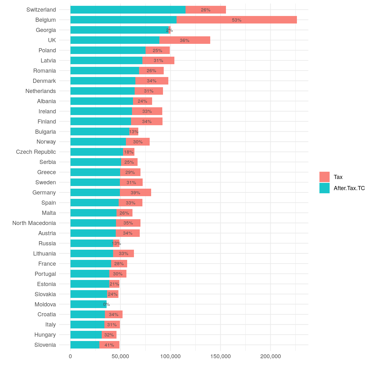
We can see that the tax burden varies significantly across countries. While the net salary is the most important factor for employees, it is also important to consider the cost of living in each country.
We have net salary, but how far does it go in each country? Let’s calculate the cost of living for each respondent and visualize the distribution of costs by country.
We have the yearly savings for each respondent, which is the difference between the net salary and the cost of living. Having known household size and share of household expenses, we can calculate the cost of living for a household of a certain size. For this, we are going to employ the linear regression.
data1 <- data |> inner_join(cities, by = c("City" = "name"))
# let's exclude unrealistic values
data1 <- data1 |> filter(Share.of.Household.Expenses > 10)
data1 <- data1 |> filter(Yearly.Savings < After.Tax.TC)

data1 <- data1 |> mutate(Cost.of.Living = (After.Tax.TC - Yearly.Savings) / Share.of.Household.Expenses * 100)
# let's convert Household.Size to a factor
data1 <- data1 |> mutate(Household.Size = as.factor(round(Household.Size)))

model <- lm(Cost.of.Living ~ 0 + Country + Household.Size, data = data1)

model_coef <- summary(model)$coefficients |>
  data.frame() |>
  rownames_to_column("value") |>
  mutate(
    effect = Estimate,
    error = `Std..Error`,
    p.value = `Pr...t..`,
    significant = p.value < 0.05
  )

model_coef <- model_coef |>
  mutate(
    variable = case_when(
      str_detect(value, "Country") ~ "Country",
      str_detect(value, "Household.Size") ~ "Household Size",
      str_detect(value, "Lifestyle") ~ "Lifestyle"
    )
  )

model_coef <- model_coef |> mutate(value = sub("Country", "", value))
model_coef <- model_coef |> mutate(value = sub("Household.Size", "", value))
model_coef <- model_coef |> mutate(value = sub("Lifestyle", "", value))

country_coef <- model_coef |>
  filter(variable == "Country") |>
  arrange(desc(effect))
country_coef <- country_coef |>
  mutate(rownumber = 1:nrow(country_coef))

xlim <- c(
  min(country_coef$effect - country_coef$error),
  max(country_coef$effect + 2 * country_coef$error)
)
xscale <- c(0, 25000, 50000, 75000, 100000)
The model Cost.of.Living ~ 0 + Country + Household.Size has an adjusted R-squared value of 0.75. We will not use Lifestyle as a factor in the model, as some of the levels have a small number of observations.
Let’s look at the coefficients for the country variable. Basically, the effect represents cost of living for a single person.
country_coef[1:17, ] |>
  ggplot(aes(x = effect, y = reorder(value, effect), colour = significant)) +
  geom_point() +
  geom_errorbarh(aes(xmin = effect - error, xmax = effect + error),
    height = .2
  ) +
  geom_text(aes(label = paste("p =", format(p.value, digits = 2))),
    vjust = 1.5,
    hjust = -0.2,
    colour = "grey55",
    fill = "white",
    size = 2.5
  ) +
  geom_vline(
    xintercept = 0,
    linetype = "dashed",
    colour = "grey55"
  ) +
  theme_minimal() +
  coord_cartesian(xlim = xlim) +
  scale_x_discrete(limits = xscale, labels = scales::comma) +
  theme(legend.position = "none") +
  labs(x = "", y = "")
country_coef[18:34, ] |>
  ggplot(aes(x = effect, y = reorder(value, effect), colour = significant)) +
  geom_point() +
  geom_errorbarh(aes(xmin = effect - error, xmax = effect + error),
    height = .2
  ) +
  geom_text(aes(label = paste("p =", format(p.value, digits = 2))),
    vjust = 1.5,
    hjust = -0.2,
    colour = "grey55",
    fill = "white",
    size = 2.5
  ) +
  geom_vline(
    xintercept = 0,
    linetype = "dashed",
    colour = "grey55"
  ) +
  theme_minimal() +
  coord_cartesian(xlim = xlim) +
  scale_x_discrete(limits = xscale, labels = scales::comma) +
  theme(legend.position = "none") +
  labs(x = "", y = "")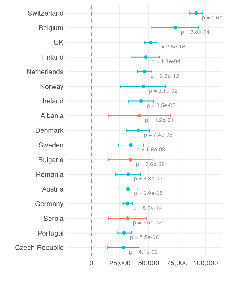
Next, we will look at the effect of household size on the cost of living. As expected, total cost of living for the two people is higher than for a single person, but the cost per person is lower for a larger household.
xscale <- c(0, 10000, 20000, 30000, 40000, 50000)
xlim <- c(-10000, 60000)

model_coef |>
  filter(variable == "Household Size") |>
  ggplot(aes(x = effect, y = reorder(value, desc(value)), colour = significant)) +
  geom_point() +
  geom_errorbarh(aes(xmin = effect - error, xmax = effect + error),
    height = .2
  ) +
  geom_text(aes(label = paste("p =", format(p.value, digits = 2))),
    vjust = 1.5,
    hjust = -0.2,
    colour = "grey55",
    fill = "white",
    size = 2.5
  ) +
  geom_vline(
    xintercept = 0,
    linetype = "dashed",
    colour = "grey55"
  ) +
  theme_minimal() +
  coord_cartesian(xlim = xlim) +
  scale_x_discrete(limits = xscale, labels = scales::comma) +
  theme(legend.position = "none") +
  labs(x = "", y = "")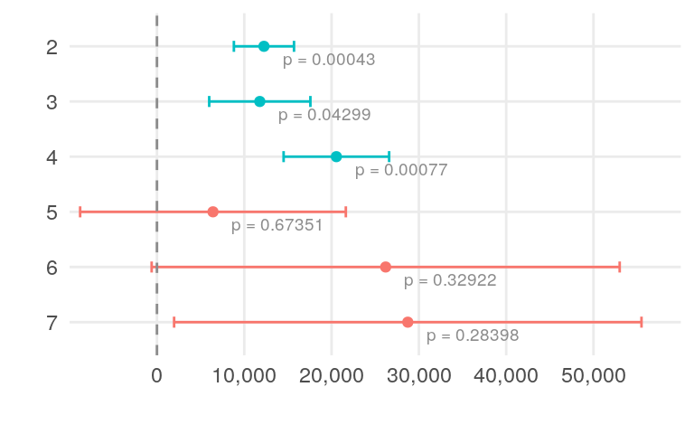
Finally, let’s look at the distribution of yearly savings by country. We will employ the same approach as before, using a linear regression model to understand the factors affecting savings. We will use Country, Household.Size, Job.Category, Seniority, and Share.of.Household.Expenses as predictors.
data1 <- data |> inner_join(cities, by = c("City" = "name"))
# let's exclude unrealistic values
data1 <- data1 |> filter(Share.of.Household.Expenses > 10)
data1 <- data1 |> filter(Yearly.Savings < After.Tax.TC)
# let's convert Household.Size to a factor
data1 <- data1 |> mutate(Household.Size = as.factor(round(Household.Size)))
data1 <- data1 |> mutate(Share.of.Household.Expenses = Share.of.Household.Expenses / 100)
data1 <- data1 |> left_join(read.csv("data/job-categories.csv"), by = "Job.Title")
model <- lm(Yearly.Savings ~ 0 + Country + Household.Size + Job.Category + Seniority + Share.of.Household.Expenses, data = data1)
model_coef <- summary(model)$coefficients |>
data.frame() |>
rownames_to_column("value") |>
mutate(
effect = Estimate,
error = `Std..Error`,
p.value = `Pr...t..`,
significant = p.value < 0.05
)
model_coef <- model_coef |>
mutate(
variable = case_when(
str_detect(value, "Country") ~ "Country",
str_detect(value, "Household.Size") ~ "Household Size",
str_detect(value, "Lifestyle") ~ "Lifestyle"
)
)
model_coef <- model_coef |> mutate(value = sub("Country", "", value))
model_coef <- model_coef |> mutate(value = sub("Household.Size", "", value))
model_coef <- model_coef |> mutate(value = sub("Lifestyle", "", value))
country_coef <- model_coef |>
filter(variable == "Country") |>
arrange(desc(effect))
country_coef <- country_coef |> mutate(rownumber = 1:nrow(country_coef))
xlim <- c(
min(country_coef$effect - country_coef$error),
max(country_coef$effect + 1.2 * country_coef$error)
)
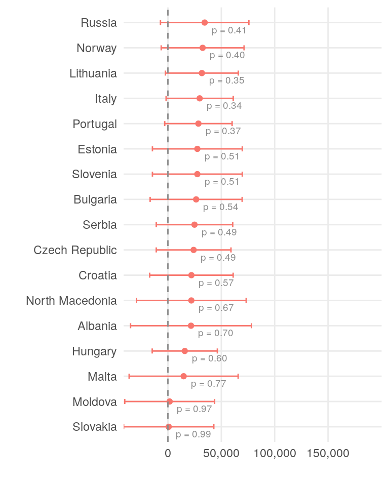
xscale <- c(0, 25000, 50000, 75000)This model performs on a mediocre level, with an adjusted R-squared value of 0.56. The coefficients for the country variable represent the expected yearly savings for a single person.
country_coef[1:17, ] |>
  ggplot(aes(x = effect, y = reorder(value, effect), colour = significant)) +
  geom_point() +
  geom_errorbarh(aes(xmin = effect - error, xmax = effect + error),
    height = .2
  ) +
  geom_text(aes(label = paste("p =", format(p.value, digits = 2))),
    vjust = 1.5,
    hjust = -0.2,
    colour = "grey55",
    fill = "white",
    size = 2.5
  ) +
  geom_vline(xintercept = 0, linetype = "dashed", colour = "grey55") +
  theme_minimal() +
  coord_cartesian(xlim = xlim) +
  scale_x_discrete(limits = xscale, labels = scales::comma) +
  theme(legend.position = "none") +
  labs(x = "", y = "")
country_coef[18:34, ] |>
  ggplot(aes(x = effect, y = reorder(value, effect), colour = significant)) +
  geom_point() +
  geom_errorbarh(aes(xmin = effect - error, xmax = effect + error),
    height = .2
  ) +
  geom_text(aes(label = paste("p =", format(p.value, digits = 2))),
    vjust = 1.5,
    hjust = -0.2,
    colour = "grey55",
    fill = "white",
    size = 2.5
  ) +
  geom_vline(
    xintercept = 0,
    linetype = "dashed",
    colour = "grey55"
  ) +
  theme_minimal() +
  coord_cartesian(xlim = xlim) +
  scale_x_discrete(limits = xscale, labels = scales::comma) +
  theme(legend.position = "none") +
  labs(x = "", y = "")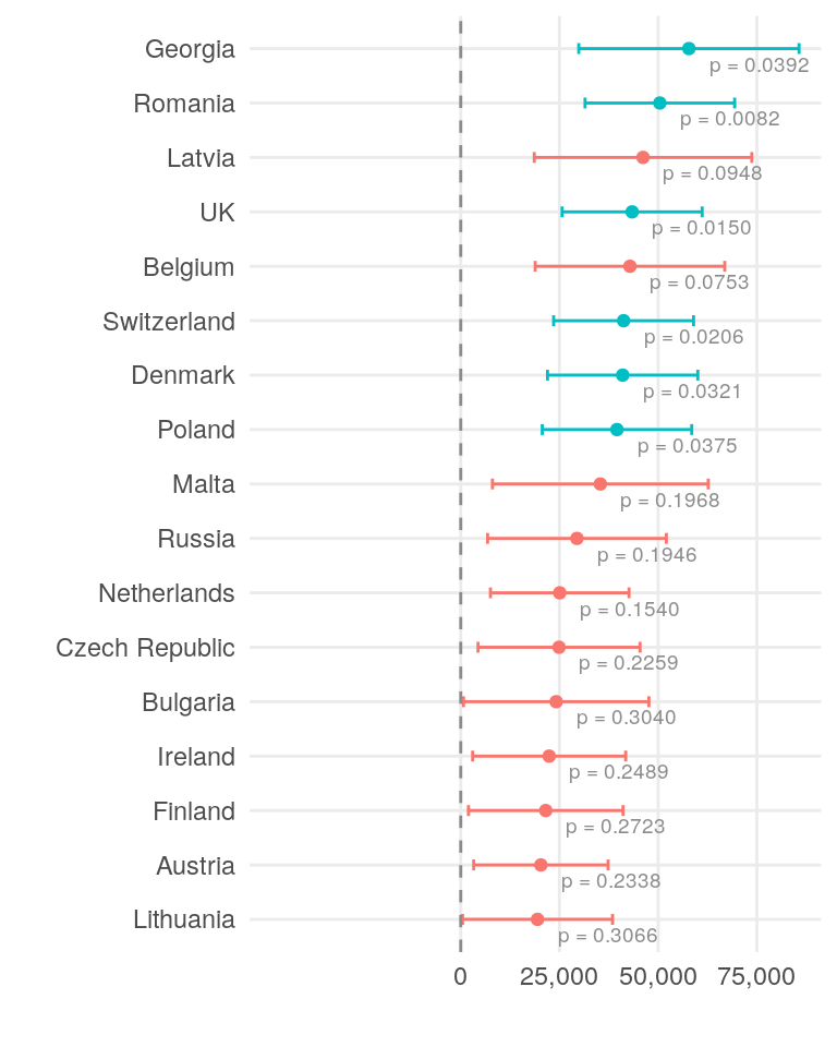
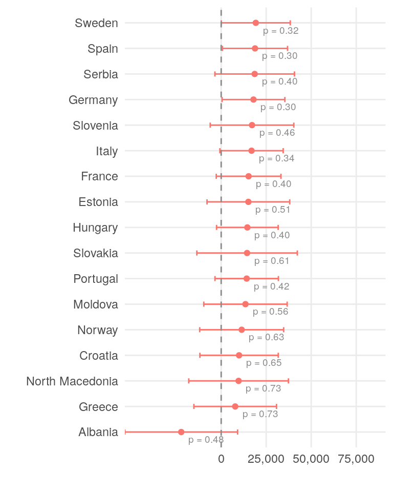
Only a few countries show a statistically significant impact on yearly savings. While differences in salary and cost of living across countries and roles are concrete factors, individual spending habits and lifestyle choices play an even more significant role in determining yearly savings.
This analysis offers several key insights. While the following conclusions are statistically significant at the 0.05 level, they may not apply to every individual case.
The top three countries for gross salary are Belgium, Switzerland, and the United Kingdom. These same countries also lead in net salary.
Belgium has the highest tax burden, followed by Germany and the UK.
Switzerland has the highest cost of living, with Belgium and the UK also ranking high. Hungary, Spain, and Italy are among the least expensive countries.
The highest yearly savings in the sample are found in Georgia and Romania, followed by the UK, Switzerland, and Denmark.