Introduction
This project showcases my process of building analytical dashboard for business decision-making, specifically in the e-commerce domain. The dashboard is built in Power BI and integrates R scripts for advanced analytics. The dashboard was created as part of the November 2025 DataDNA Dataset Challenge and was selected as the winner in both overall and accessibility categories.
Key Features
The dashboard includes several analytical features. The implementation of these involved data processing and modeling techniques, which I will outline below.
Revenue Forecast
For the executives it’s important to know ahead of time whether the revenue will meet the target for the set period. To address this, I implemented a time series forecasting model. The model takes into account seasonality and trends to provide accurate revenue predictions. Due to the limited data span of less than two years, I opted for a simpler forecasting approach using auto.arima function from R’s forecast package.

The model was used to generate revenue forecasts for various segments, including country, category, and channel. I integrated the forecasting results into the Power BI dashboard, enabling users to easily view and interact with forecasts alongside historical data, with smooth segment switching when applying cross-filtering.
ABC/XYZ Analysis
A classic way to segment products is by using ABC analysis. This method classifies products based on their revenue, placing items that contribute the most to revenue in category A, those with moderate contribution in category B, and the rest in category C.

To complement this, I applied XYZ analysis, which segments products based on their sales variability. Products with stable demand are classified as X, those with moderate variability as Y, and highly variable products as Z. Combining ABC and XYZ analyses provides a comprehensive view of product performance, enabling more informed inventory and marketing strategies.
RFM Segmentation
Another widely used customer segmentation technique is RFM analysis, which focuses on three key metrics: Recency (how recently a customer made a purchase), Frequency (how often they purchase), and Monetary value (how much they spend). By scoring customers on these dimensions, businesses can identify their most valuable customers and tailor marketing efforts accordingly.

To make the segmentation more intuitive, I defined nine segments (levels) based on RFM scores: “Champions”, “Loyal Customers”, “New Customers”, “Potential Loyalists”, “Promising”, “Needs Attention”, “Cannot Lose Them”, “At Risk”, “Hibernating”. This categorization helps in devising targeted strategies for customer retention and engagement.
Details of Implementation
Data Cleaning and Transformation
The most data cleaning and transformation steps were performed using R scripts running in Power Query, but first I explored the dataset in RStudio. Here are the documents produced by Quarto during the data analysis phase:
You can find source code in the form of the R markdown documents in the project repository.
| Document | Description |
|---|---|
| Exploratory Data Analysis | The initial steps to explore dataset structure, factors and distributions. |
| Preprocess in Power Query | The R code for processing dataset in Power Query, including RFM and ABC/XYZ segmentations. |
| Time-Series Forecasting | The separate document containing R code for time-series forecasting, also designed to run in Power Query. |
| Refund Prediction | An attempt to create a model to predict refunds; no variables with statistical significance found. |
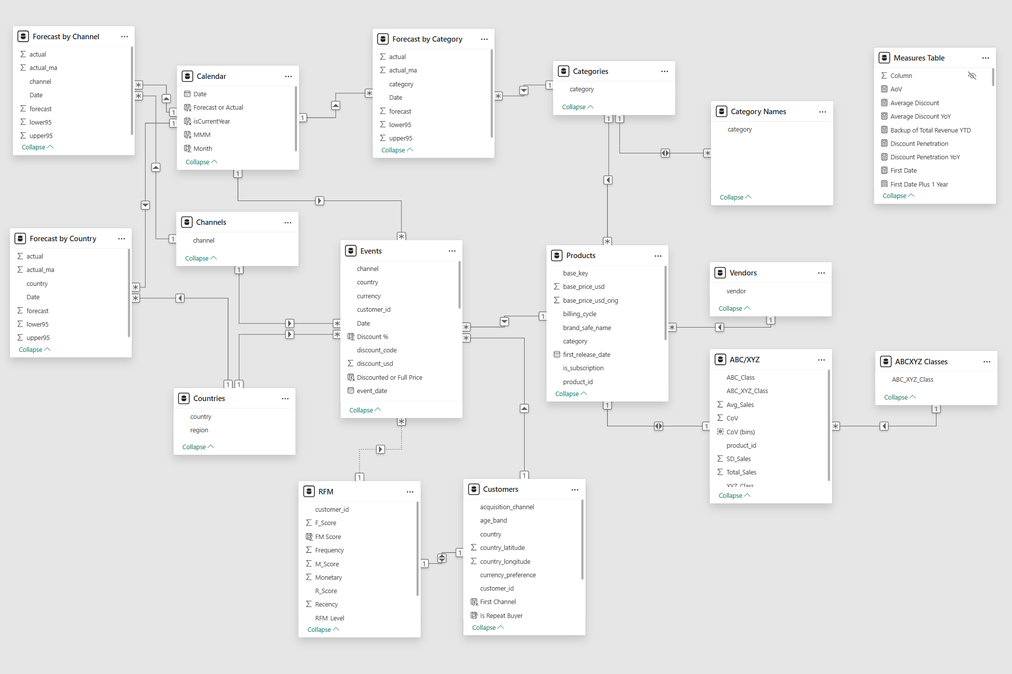
Power BI Data Model
Tables and relations in the Power BI data model are organized following a “star” schema, with fact tables at the center connected to dimension tables. This structure optimizes query performance and simplifies data analysis.
Power BI Visuals
Power BI visualizations are built using visuals from the standard Power BI library, except for a few bar charts created with the Deneb custom visual, which allows for advanced charting using the Vega-Lite grammar.
Dashboard Overview
The dashboard is structured into five key sections.
You can try interactive version of the dashboard here
Summary Page
The dashboard immediately shows key metrics.

Loyalty Section
This section presents customer loyalty metrics, including Repeat Buyers Share, Life-time Value, and Purchase Frequency.

Products Section
This section provides descriptive statistics about products. It includes ABC/XYZ analysis, Total Revenue breakdown by Category and Vendor, and Top Products.

Pricing Section
Pricing section provides insights into product pricing strategies, including Discount Penetration, Average Discount, and Revenue Lift from Discounts, as well as time series of Average Discount and Discount Penetration.

Customers Section
This tab presents the RFM segmentation results, showing the distribution of customers across different segments and their contribution to total revenue.

Areas to Improve
Dynamic Time Periods
The latest data point in the dataset is 2025-10-21. All visuals in the dashboard reflect the data for the calendar year 2025, using time-series forecasting for the remaining months. This makes the dashboard unsuitable for use outside of the narrow period of October-December 2025. To make this dashboard a working instrument, I would need to implement a slicer for selecting the time period and adjust all measures accordingly. The year slicer would not be a good choice for this task, I’d rather opt for a date slicer with “Relative date filtering” option set to “in the last 12 months” plus 1..2 month forecast.
Web and Marketing Data
The dataset lacks web-analytics data, which would enable more comprehensive customer behavior analysis. Additionally, the absence of marketing data (except for the acquisition channel) prevents the evaluation of campaign effectiveness and customer acquisition strategies. Incorporating these data sources would significantly enhance the analytical capabilities of the dashboard.
Causal Modeling
The synthetic nature of the dataset also limits the depth of analysis: the data is too random to uncover meaningful patterns or trends. Access to real-world data would allow for causal modeling and insights.
Conclusion
I hope this overview of the dashboard construction process, from initial data cleaning to final model integration, gives the reader a clear picture of the analytical work involved.